Showing posts with label package design. Show all posts

June 17, 2011

judging wine

I love this blog post about the merits of choosing wine solely on the appearance of the label. I have long been a proponent of this strategy for selecting a bottle of wine. I'm not a big wine drinker (obviously?) but my strict standards for label appearance have rubbed off on my husband. He brought home this Line 39 cabernet knowing I would appreciate its simplicity and the carefully overlapping numbers.


My taste falls squarely in the Graphic Design Student category - about half-way between Letterpress and Indie Designer. What about you?
If you need a creative designer to improve your graphic identity, contact me for a consultation.

May 4, 2011

bee mobile

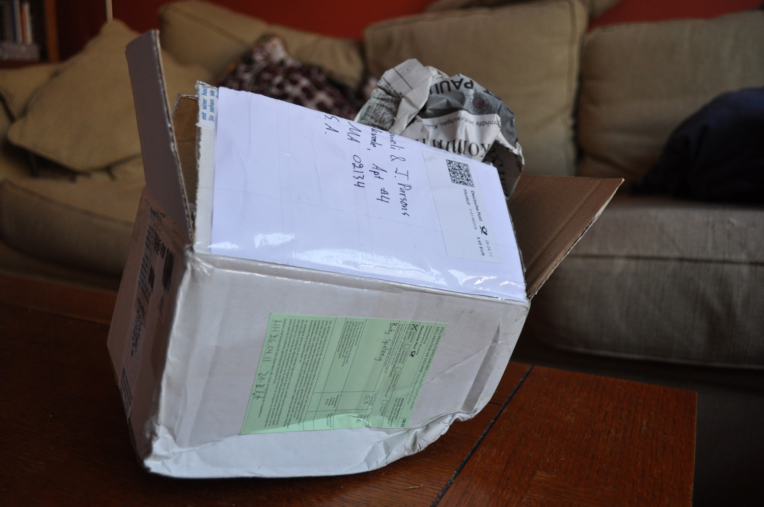
Imagine my excitement to receive an overseas package this week. What a treat!


I wasn't sure the contents had survived the clearly difficult voyage.


Inside I found this gorgeously packaged and well designed bee mobile from Maya Organic.


I adore it and Matías is already so good at staring, he took to it immediately.
If you need a creative designer to improve your graphic identity, contact me for a consultation.

April 6, 2011

fabulous packaging

Here are some gorgeous and truly inspiring package designs that I ran into at Creature Comforts. I don't have a lot of experience with package design but seeing things like this makes me want to branch out!

Designed for Marks & Spencer by illustrator Stuart Kolakovic. I feel soothed by this tea without even drinking it.


Designed for Life.NK from Space.NK by illustrator Mio Matsumoto. I love the simplicity of each illustration and the relationship to each product's intended affects. So cool!


Designed for 8th Continent by artist Ben Javens. I love the use of color and the consistency across the flavors while still having each one look unique and identifiable.

Great packaging makes my day.
If you need a creative designer to improve your graphic identity, contact me for a consultation.

February 18, 2011

minimalism

There's a great post on Antrepo4 about minimalism in packaging design. They took some major name brands and re-worked them in 2 steps towards a very minimal look.


In those examples I prefer the right. I'm definitely a less-is-more designer.


In the Lindt and Corn Flakes examples I prefer the middle. The right seems a smidge too far towards minimalism.

What's your take? Do you lean toward the left, the middle or the right?
If you need a creative designer to improve your graphic identity, contact me for a consultation.

August 3, 2010

iphone happiness

Returning from a vacation can be so exhausting - the unpacking, the laundry, the exhaustion when your toddler has trouble sleeping in her own room again...

The good news is that my iphone4 arrived while I was gone. I somehow found the energy to get it set up the night we got home. It was a breeze to transfer everything over from my old phone and it's quite a step up! I had the original iphone for 2.5 years and I adored it. This one is better! It's lighter, the screen is extra sharp, it's kind of amazing. I'm not a total apple geek (both of my computers run windows - gasp!) but they have no competition when it comes to package design.


Yum.