This blog is a place for me to share beautiful, well-designed things. By things I mean anything that catches my eye within a wide range of interests - art and architecture, fashion and jewelry, typography, useful household items, interior design, landscape design, photography... you get the idea.
December 22, 2010
tree alternative
I love this ornament tree idea from Not Martha. If you love it too you can follow the do-it-yourself instructions. Or you can just admire the photos.
So creative and so simple.
December 20, 2010
crayon projects
As anyone with a toddler will tell you, crayons don't last long. In our house we have a crayon bin that is at least half-filled with broken pieces of crayon. Wondering what to do with those broken pieces? I saw these great do-it-yourself ideas on Ohdeedoh.
Melted Crayon Ornaments or Gift Tags - I love these. You can even draw with them again when you're done.
Crayon Chip Wrapping Paper - from Momtastic. Gorgeous!
Melted Crayon Ornaments or Gift Tags - I love these. You can even draw with them again when you're done.
Crayon Chip Wrapping Paper - from Momtastic. Gorgeous!
December 15, 2010
wrapping paper
I saw this hand-printed wrapping paper on Design Sponge earlier this week and I haven't been able to stop thinking about it. Isn't it just stunning?
I love the colors, the intricacy of the patterns and the irregularity of the hand-printing.
Gorgeous!
December 9, 2010
wall calendars
These calendars take the meaning of wall calendars to a whole new level. I love them all. They are a visual expression of how my brain works. I'm organized to a fault and have a calendar brain.
This is a do-it-yourself project from Martha Stewart. Of course! I wish I had the time and an extra wall.
Dry-erase vinyl wall stickers make up this calendar. This is what my office looks like. In my mind.
Interior design from Pinch Design. Yummy.
Special thanks to my mother-in-law for pointing me to this blog post about calendars. She knows me well.
December 1, 2010
advent calendar
Growing up I loved having advent calendars and counting down to Christmas. Now that I have my own family I'm excited to get the tradition going again.
I came across this one recently from J. Hill Design and I think it's lovely.
I like the non-ordered numbers and the abstract drawings. Also, it's a DIY calendar with a free download with any purchase!
I came across this one recently from J. Hill Design and I think it's lovely.
I like the non-ordered numbers and the abstract drawings. Also, it's a DIY calendar with a free download with any purchase!
November 29, 2010
hannukah
Since Hannukah starts on Wednesday I feel I have an excuse to jump straight from Thanksgiving into Hannukah and Christmas mode! Hooray!
I went looking for nicely designed menorahs and found a ton in every different style imagineable and some with shocking price tags. My favorite is this simple branching design from Crate & Barrel. Also, it's affordable.
Rustic Menorah - $26.95 Crate & Barrel
I also ran into this cool DIY dreidel mobile.
Happy Hannukah. Next up, advent calendars!
November 23, 2010
feeling thankful
Things I am amazingly thankful for:
- My job! People pay me to make things beautiful. Awesomeness.
- My family. I have the best family and we all get along so well - in-laws included! I feel sad that so many people dread holiday family time.
- My pregnancy. Double yay for being pregnant for the holidays. Yum.
- Having a nearly 3-year-old who says things like "I love you a lot Mommy" while we are working on a puzzle.
- Being healthy! Last year I spent Thanksgiving fighting the swine flu. Not fun.
November 19, 2010
thanksgiving
I truly love Thanksgiving. I don't think there's a better holiday. It's not based on any particular religion, it involves fantastic food and lots of family time, and it guarantees a 4-day weekend. From a design perspective I prefer to decorate with fall colors and natural elements, rather than references to turkeys or pilgrims. As always when approaching a holiday, I found a lot of inspiration from Martha Stewart.
November 15, 2010
typographic maps
Check out this crazy, incredibly detailed, type-only map of Boston from Axis Maps. You can get a print of Boston or Chicago for $30. These maps include everything - streets, parks, tunnels and waterways only using type. I'm super impressed.
Labels:
typography
November 9, 2010
calendars again
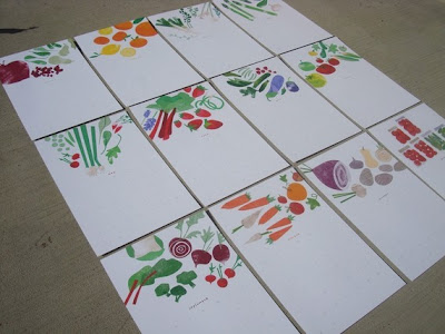
I keep seeing these beautiful calendars. I can't stop posting about them! Here are two that I saw on Design Sponge recently.
2011 Seasonal Garden Calendar - I love the format of this, that you can untie it and spread them all out. That at the end of the year you can trim off the calendar part and keep the amazing illustrations. Awesome.
2011 Botanical Wall Calendar - I love the simplistic design and illustrations on this one. And the format with the giant clip that holds it together. Simply gorgeous.
I'm still not feeling ready for a new year.
Labels:
calendars,
color,
illustration
November 1, 2010
whimsical paintings
During a recent trip to Rockport, MA I ran across some fun and colorful paintings by the talented Lauri Kaihlanen.
I wanted to buy a whole bunch of these small prints and cover my daughter's wall with them. I had my heart set on the lion or the giraffes until I saw the funky penguin and the bicycling turtles. So much fun! In the end I decided to some day bring my daughter to the studio and let her pick out a few of her favorites. Maybe when we have more space and she has her own room!
October 27, 2010
decorating with type
I know I'm a type dork but seriously, how cool are these typographic decorations?
Here are some letterpress letters from Jessica Hische that I'm just a little bit obsessed with.
I couldn't even decide which letters to show. Check out the H and the Z too. They are all so interesting individually but go so well together. She mentions on her site that a great wedding present would be 2 letters and an ampersand. Brilliant!
And can you imagine a cooler set of drawers?
These are from Kent and London and are solid oak. I want them for my office.
October 22, 2010
apples
In the spirit of the season, here are some beautiful apple-inspired objects.
Studded Brass Apple - This one reminds me of my grandmother who had a collection of various studded fruits in glass.
Apple Pot - So simple and elegant.
Wooden Apple Box - I really like the pattern on this one and the use of color.
Happy Fall! (It's my favorite season, can you tell?)
Studded Brass Apple - This one reminds me of my grandmother who had a collection of various studded fruits in glass.
Apple Pot - So simple and elegant.
Wooden Apple Box - I really like the pattern on this one and the use of color.
Happy Fall! (It's my favorite season, can you tell?)
October 20, 2010
calendar goodness
Here's another awesome calendar for 2011. Perfect for a type lover or designer.
A Year in Caps by Heather Lins. I love how the type overlays and is still super legible and elegant.
Gorgeous!
October 15, 2010
colorful wall decals
Here are some of my favorite colorful wall decals. I think these are a brilliant design solution, especially in a child's bedroom as they are easy to switch as the child grows.
Tree with Birds from Couture Deco. I love their single-color decals. I think it would be really easy to plan a room around just one color.
Noah's African Circus from Pop & Lolli. On a neutral wall, these colorful animals would make anyone happy.
Big Blowing Cherry Blossom Tree from Surface Inspired. This one looks very elegant and would work for a girl at almost any age.
I've never used these but they are supposed to be easy to apply and easy to remove. Such a great way to spice up a room!
October 13, 2010
logo redesign fail
The Gap tried to roll out a new logo recently.
After 1 week and tons of bad feedback, they reverted to the original.
Reverting to the original makes them look weak and wishy-washy, but in this case I think it was the right decision. The new logo lacks the height and elegance of the original and uses helvetica which is one of the most ubiquitous fonts available. I hope other companies take this as a lesson - don't re-brand for no reason, and don't roll out a new logo unless you're sure it's an improvement.
Labels:
logos
October 8, 2010
colorful notebooks
I love these simple, vibrantly colored notebooks from Ecosystem. They are customizable (3 different sizes, lines, grids, inside pockets), made from 100% recycled paper, affordable ($10-20) and made in the USA.
Aren't they delicious?
October 4, 2010
calendar time
I love this mini desk calendar from Paper Source. It works great as one large piece but how cute that it has a tiny little stand. This would look perfect on my desk.
Can you believe it's already calendar time?
September 27, 2010
sandwich bags
Who knew you could find such adorable reusable sandwich bags? And they're dishwasher safe too. So smart.
I saw these on Ohdeedoh and I definitely have plans to buy several. My only problem - how will I choose just a few? I love the colors, the patterns, and the overall look of these. A brilliant idea executed so elegantly. Love it.
(photos from Lunchskins)
Subscribe to:
Posts (Atom)